Squeezey

The NASA Spacesuit User Interface Technologies for Students (SUITS) Challenge invites student teams to design an augmented reality (AR) spacesuit information display that could support future Artemis missions.
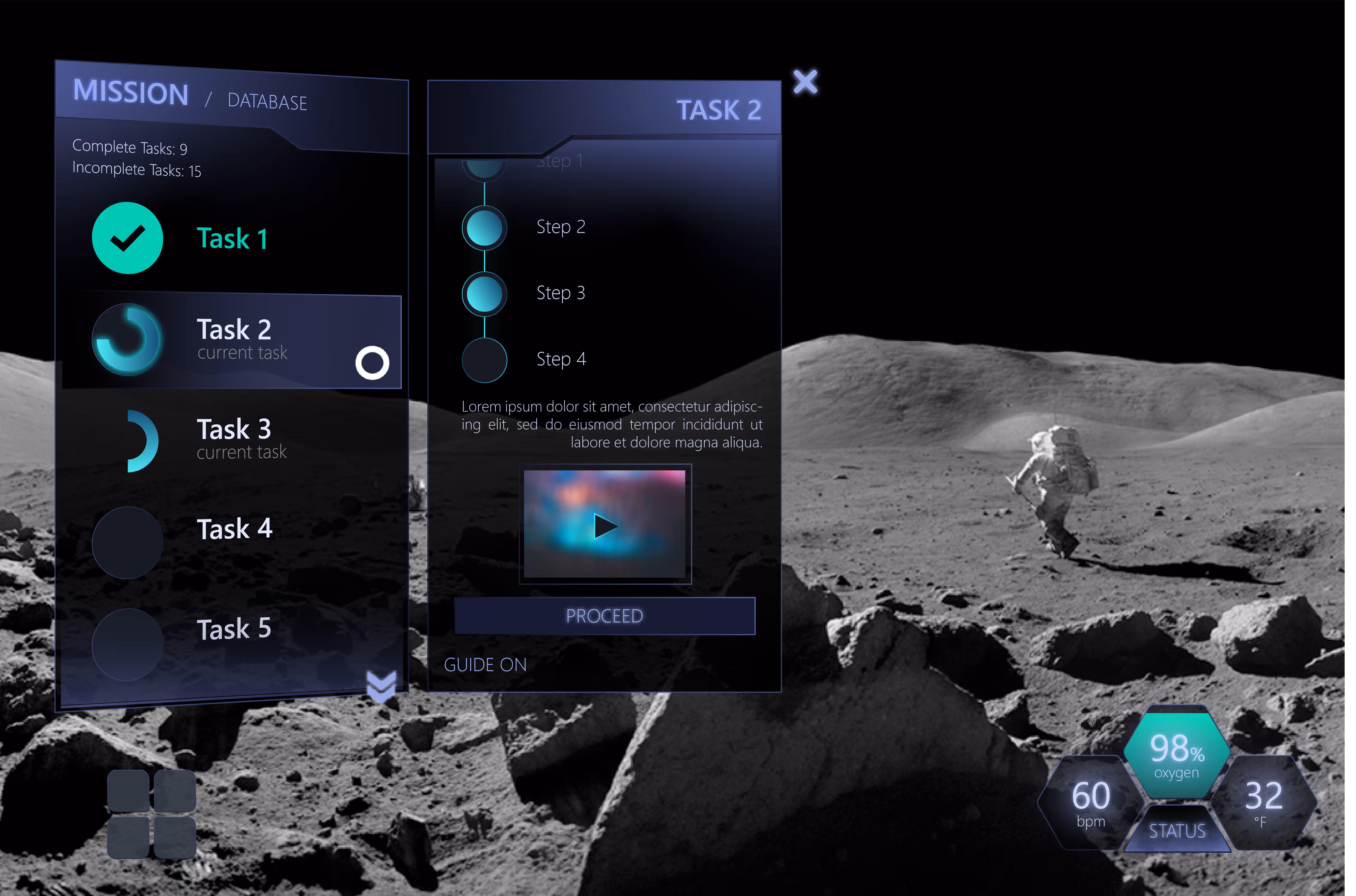
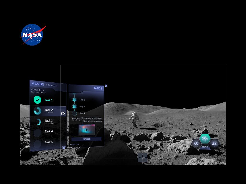
As the sole UX/UI designer in a team of 13 engineers and developers, I co-created LCD24, an AR interface running on the Microsoft HoloLens 2 that provides astronauts with hands-free access to the following features:

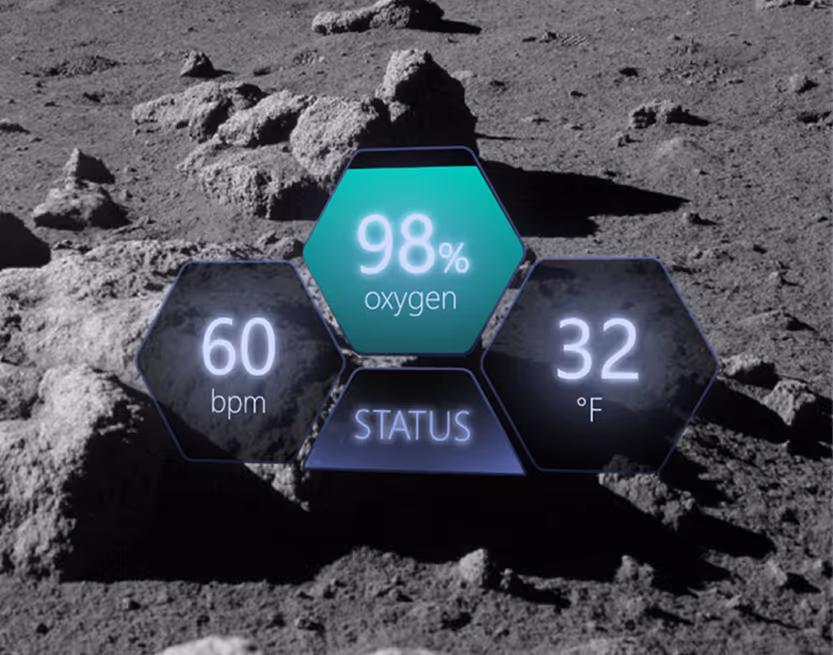
🫀 Vitals checker
✅ Task manager
🧪 Science sampling database
☎️ Communication systems
📍 Navigation
[.highlighted-textsmall]LCD24 was my first experience with AR and UX/UI design.[.highlighted-textsmall] The learning curve was steep, and I navigated this first-time experience during the peak of COVID-19 with my team, our advisor, a NASA mentor, and other consultants to understand spacewalk operations and to design for the unique constraints of spacesuit environments where traditional interaction methods pose significant functional barriers and potential safety risks.
Our team delivered a prototype for the main menu and a portion of the task manager. The rest didn’t make it past the conceptual design phase due to some logistical issues that arose around the time; however, despite the difficulty, [.highlighted-textsmall]we made it to the Top 20 teams nationwide.[.highlighted-textsmall]
The project demonstrated how AR technology could transform spacesuit interfaces from paper-based systems and closed communication loops to intuitive, context-aware displays that enhance mission efficiency and user safety.
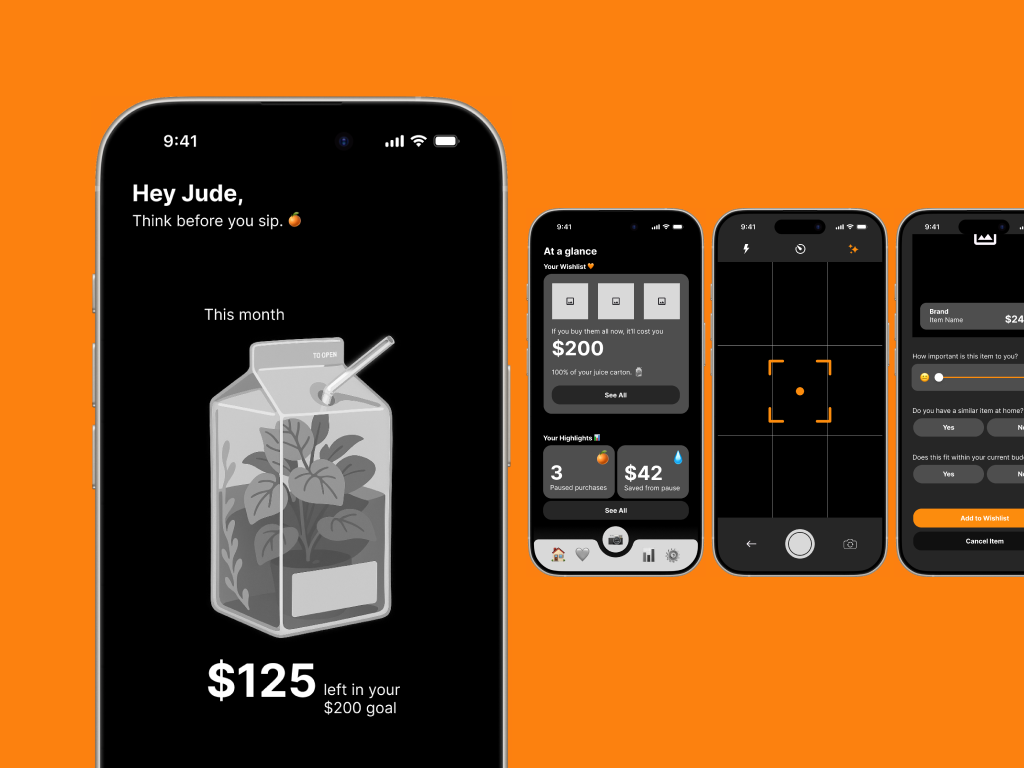
Squeezey is a budgeting app prototype designed to help users manage impulse spending by supporting mindful decision-making in the moment. The app introduces playful visual metaphors, like a juice box representing discretionary funds, and interactive features such as a wishlist and a “Think Before You Buy” camera to gently slow down impulsive purchases. [.highlighted-text]Squeezey emphasizes positive reinforcement over guilt, guiding users to reflect, make intentional spending choices, and develop healthier habits.[.highlighted-text] The prototype demonstrates how thoughtful UX/UI design can address emotional and behavioral challenges in personal finance.

NASA astronauts performing extravehicular activities (EVAs) face critical limitations with current spacesuit systems, posing functional barriers and safety risks to the user.
[.highlighted-textsmall]Current spacesuits require enormous physical strength to perform basic tasks[.highlighted-textsmall] due to pressurization. The bulky suits severely limit hand movement, making it exhausting to collect geological samples.
[.highlighted-textsmall]NASA procedures remain largely paper-based.[.highlighted-textsmall] EVA astronauts depend on intravehicular (IVA) astronauts inside the command pod to update their checklists found on their cuffs. The IVA person reads the task aloud to the EVA person instead of accessing information directly through a display.
[.highlighted-textsmall]Navigation relies on memory and a complicated communications loop.[.highlighted-textsmall] Astronauts usually memorize the route to their destination instead of following a map. This entails unprecedented issues which, in a foreign environment like the Moon, can develop into a critical safety problem. Sometimes they can’t track their colleagues, and communication occurs over a single open loop involving all crewmembers, creating confusion and limiting private exchanges.
[.highlighted-textsmall]Feedback systems are outdated.[.highlighted-textsmall] Old spacesuits lacked internal displays for astronauts to view their own vitals. Data like heart rate, suit pressure, and oxygen levels were monitored externally by mission control or they were visible only through minimal exterior gauges. Astronauts relied on verbal updates and had limited real-time awareness of their own status.
Given COVID-19 constraints and our timeline, we focused on targeted research with primary users and subject matter experts.
✦ User Research
We secured an interview with astronaut Dan Bursch, which provided critical insights into the physical and cognitive challenges astronauts face during spacewalk missions. [.highlighted-textsmall]This interview revealed the extent to which spacesuit limitations impact task performance and the importance of minimizing required movement.[.highlighted-textsmall]
✦ Expert Consultation
We worked directly with our NASA mentor and an aeronautical engineer to ensure technical feasibility and alignment with NASA operating procedures.
Key Findings
✋ Minimal hand movement is essential
👁️ Visual displays must not obstruct environmental awareness
⚠️ Information hierarchy must prioritize mission-critical data
I established three core principles based on our research findings:
✦ Minimalist
Display only essential information by default at all times, like their vitals. Additional elements will appear contextually and/or by choice via customization settings.
✦ Non-obtrusive
UI elements must harmonize with the lunar environment to prevent visual fatigue and confusion. Our team’s idea is that the system must be doing the most work, not the users.
✦ Instinctive
Interaction flows require immediate, clear feedback for all user inputs.
These principles guided design decisions throughout the project, allowing us to maintain user focus despite technical constraints and timeline pressure.
From the information architecture, to the wireframes, and finally the microinteractions, I created a design system that consolidated and laid out the information in one place for the developers to refer back to.
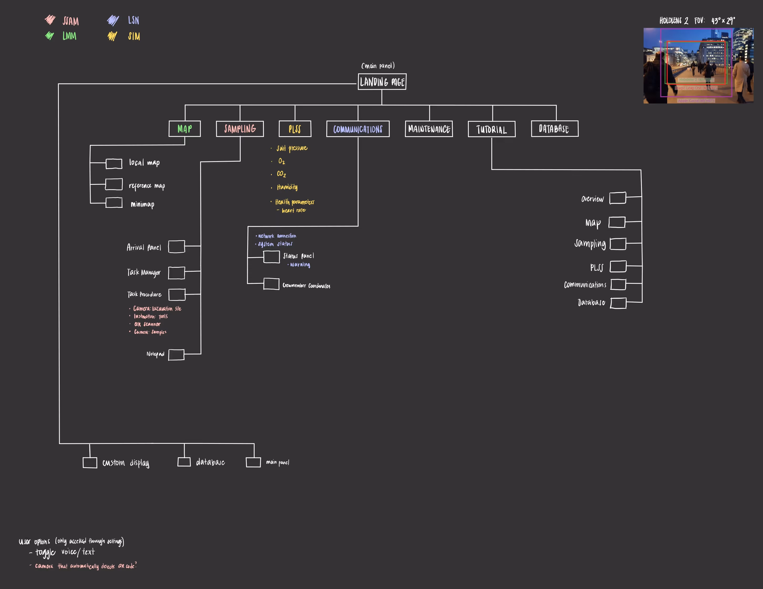
Information Architecture
I created a comprehensive sitemap organizing features around NASA standard procedures and astronaut workflow needs. I also added customization options so users could adapt the interface to individual mission requirements and so that they’d feel more comfortable with the LCD24.
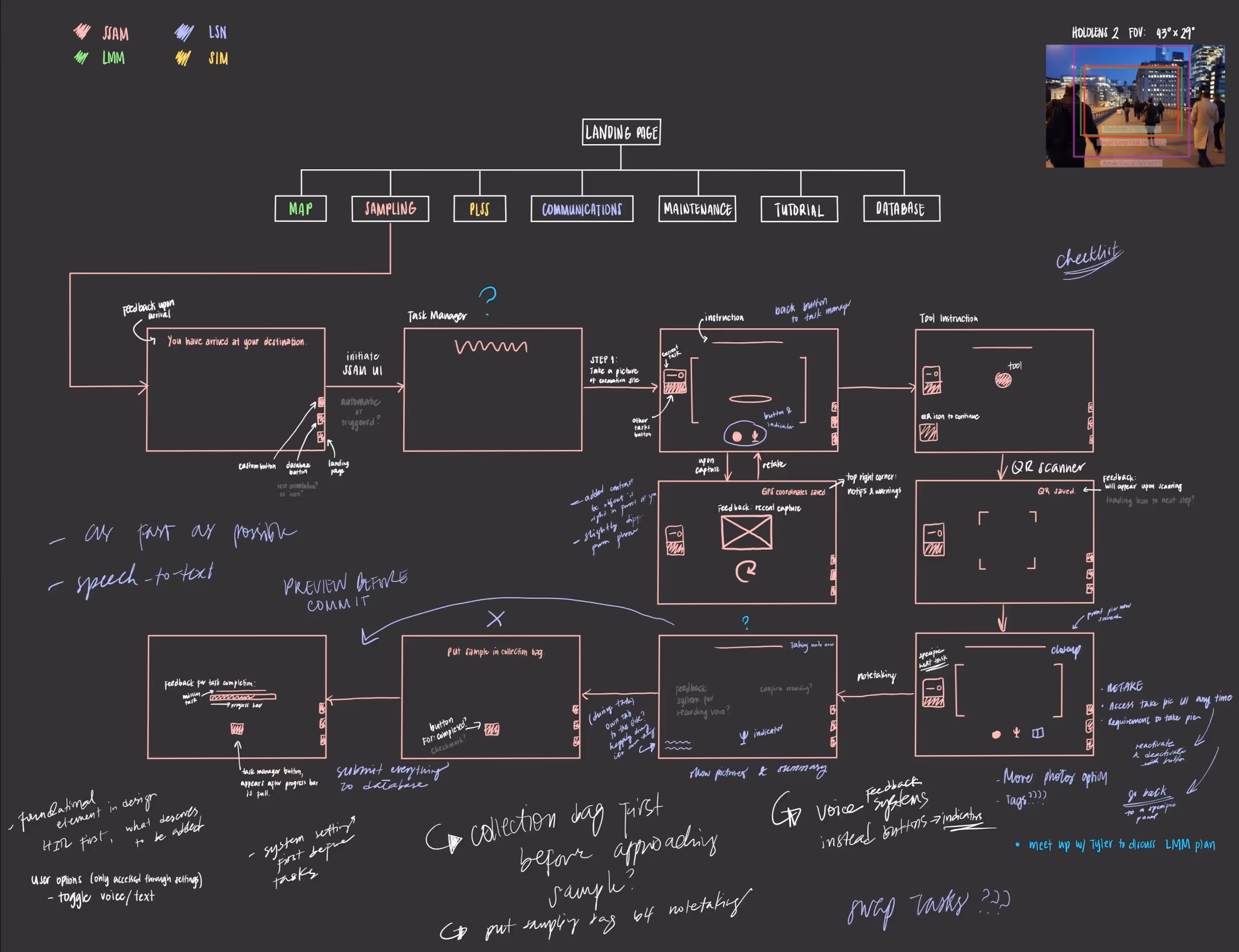
Wireframing
After a team review, the wireframe was materialized. It displayed the process flow and visual modules. With this guide in hand, it allowed for an easy basis for coding.
I also outlined which elements call for feedback cues and positioned the action buttons.
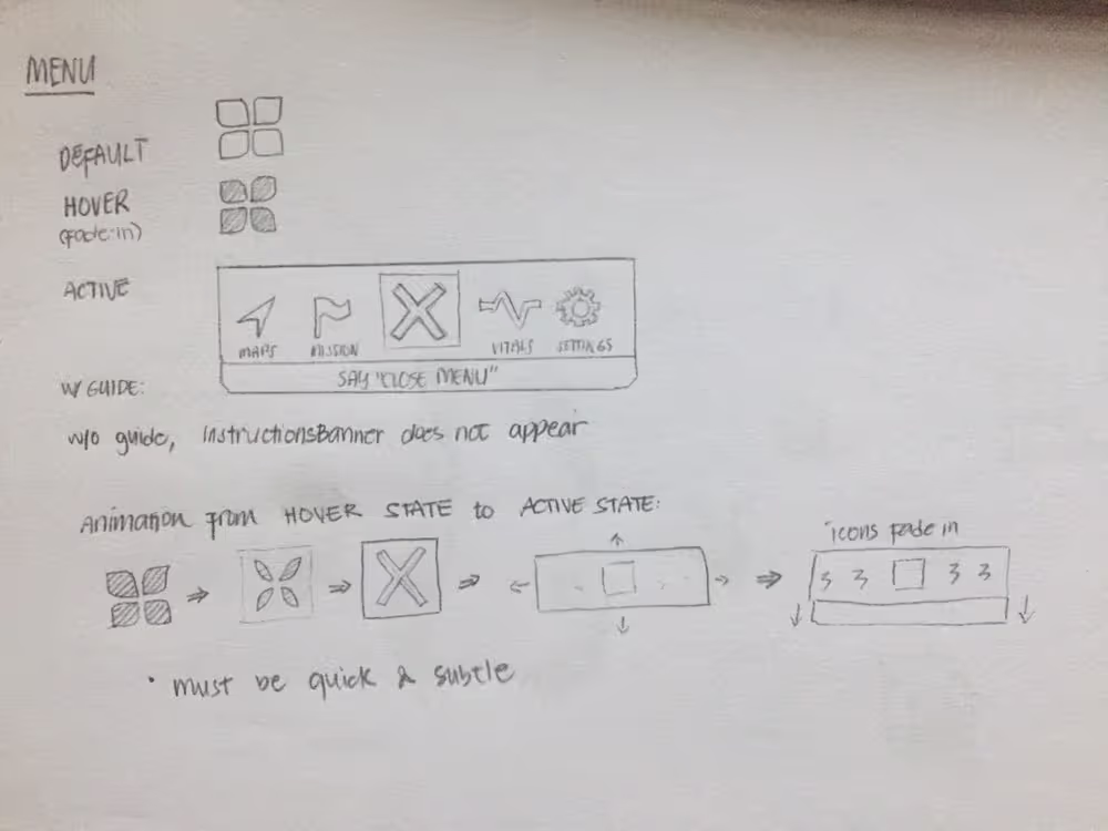
Interaction Design
I developed UI components in Illustrator that maintained visibility across varying lunar lighting conditions while reducing cognitive load through consistent visual hierarchy.
My team and I prepared the prototypes and finished the task interface, including the menu and vitals.
✦ Input Methods
[.highlighted-textsmall]The astronaut interview verified the need for a low-movement system.[.highlighted-textsmall] We designed a feedback system that responds to eye tracking and voice commands, with strategic hand gestures only for emergency or critical functions.
✦ Information Display
Vital signs remain constantly visible as they are critical to the safety of the user. Task management, navigation, and communication features appear contextually to avoid overwhelming the user during high-stress situations or certain tasks.
✦ Visual Treatment:
I designed for the UI panels to be semi-transparent with pure white text, ensuring users could still perceive the lunar environment while accessing critical information. The accent colors used are on the more vivid side to emphasize relevant information, such as oxygen level and task checklist.
[.highlighted-textsmall]The interface also leverages existing HoloLens 2 and Windows feedback mechanisms,[.highlighted-textsmall] including the light reflections that respond to hand movement and eye tracking input to build on established interaction patterns.
[.highlighted-textsmall]A huge inspiration for me was game UI design, particularly heads-up displays (HUDs), because games are one of the few domains that deal with similar challenges.[.highlighted-textsmall] While not exactly the same, games often have dynamic environments that demand a readable information display. The key part is to avoid obstructing the player’s view or breaking immersion while they complete a game task.
[.highlighted-textsmall]We delivered a functional AR prototype demonstrating the menu and a portion of the task manager.[.highlighted-textsmall] The remaining features remained in the conceptual design phase due to logistical limitations, but overall, the interface successfully integrated with the HoloLens 2 and showed the feasibility of AR-based spacesuit displays, [.highlighted-textsmall]potentially improving situational awareness, streamlining tasks, and reducing cognitive overload.[.highlighted-textsmall]
The project was presented to NASA panelists and high school students. While we didn’t advance to the Human-in-the-Loop Testing phase, we successfully proved the concept and technical approach.
[.highlighted-textsmall]This project taught me how to conduct meaningful user research under significant constraints.[.highlighted-textsmall] The single astronaut interview proved more valuable than broader survey methods would have been, providing specific insights that directly shaped design decisions.
Working as the sole designer on a technical team required clear communication of design rationale and constant advocacy for user needs during discussions. [.highlighted-textsmall]I learned to establish strong design principles early which narrowed down the scope of an otherwise large-scale project.[.highlighted-textsmall]
Our project, especially with its topic and scope, was extremely difficult to do on our own. It required a certain level of commitment to seek out resources online. [.highlighted-textsmall]Because I was the only designer and I only knew graphic design, I had to shift the way I looked at everyday things to understand how to go about the UX process.[.highlighted-textsmall] I immersed myself in design articles and closely evaluated the HoloLens 2, Windows 10, and game interfaces to understand how they respond to user input and handle interaction patterns. This helped me understand the difference between designing static visuals and creating dynamic, responsive user experiences.

Invictus is a team of students in Napa Valley College Augmented Reality Club that developed a software design for the NASA Spacesuit User Interface Technologies for Students Challenge in 2020-2021. As part of the challenge, [.highlighted-text]the team must create a spacesuit information display in an augmented reality (AR) environment.[.highlighted-text] This is to help facilitate spacewalk missions like the previously known 2024 Artemis Mission. It serves as a task management system as well as a vitals checker.
[.highlighted-text]I was the only designer for the project. On top of that, it was my first time playing in this field of design,[.highlighted-text] so I had to do research on my own to implement the UX/UI process efficiently.
Squeezey is a budgeting app prototype designed to help users manage impulse spending by supporting mindful decision-making in the moment.
The app introduces playful visual metaphors, like a juice box representing discretionary funds, and interactive features such as a wishlist and a “Think Before You Buy” camera to gently slow down impulsive purchases. [.highlighted-textsmall]Squeezey emphasizes positive reinforcement over guilt, guiding users to reflect, make intentional spending choices, and develop healthier habits.[.highlighted-textsmall] The prototype demonstrates how thoughtful UX/UI design can address emotional and behavioral challenges in personal finance.
- ✦ Navigate their environment towards the excavation site and back to the lander, as well as other geological areas of interest
- ✦ Track their mission progress
- ✦ Collect data from sampling, where they store them, and how they utilize their field notes
- ✦ Check their vitals with their suit
- ✦ Deal with varying lighting situations
Users struggle with:
- ✦ Immense guilt after spending
- ✦ Losing track of small (and/or big) purchases
- ✦ Not having a clear sense of how much “fun” money they have left
- ✦ A lack of tools that encourage mindfulness without being restrictive
NASA astronauts performing extravehicular activities (EVAs) face critical limitations with current spacesuit systems, posing functional barriers and safety risks to the user.
[.highlighted-text]Current spacesuits require enormous physical strength to perform basic tasks[.highlighted-text] due to pressurization. The bulky suits severely limit hand movement, making it exhausting to collect geological samples.
[.highlighted-text]NASA procedures remain largely paper-based.[.highlighted-text] EVA astronauts depend on intravehicular (IVA) astronauts inside the command pod to update their checklists found on their cuffs. The IVA person reads the task aloud to the EVA person instead of accessing information directly through a display.
[.highlighted-text]Navigation relies on memory and a complicated communications loop.[.highlighted-text] Astronauts usually memorize the route to their destination instead of following a map. This entails unprecedented issues which, in a foreign environment like the Moon, can develop into a critical safety problem. Sometimes they can’t track their colleagues, and communication occurs over a single open loop involving all crewmembers, creating confusion and limiting private exchanges.
[.highlighted-text]Feedback systems are outdated.[.highlighted-text] Old spacesuits lacked internal displays for astronauts to view their own vitals. Data like heart rate, suit pressure, and oxygen levels were monitored externally by mission control or they were visible only through minimal exterior gauges. Astronauts relied on verbal updates and had limited real-time awareness of their own status.
Given COVID-19 constraints and our timeline, we focused on targeted research with primary users and subject matter experts.
✦ User Research
We secured an interview with astronaut Dan Bursch, which provided critical insights into the physical and cognitive challenges astronauts face during spacewalk missions. [.highlighted-text]This interview revealed the extent to which spacesuit limitations impact task performance and the importance of minimizing required movement.[.highlighted-text]
✦ Expert Consultation
We worked directly with our NASA mentor and an aeronautical engineer to ensure technical feasibility and alignment with NASA operating procedures.
✦ Key Findings
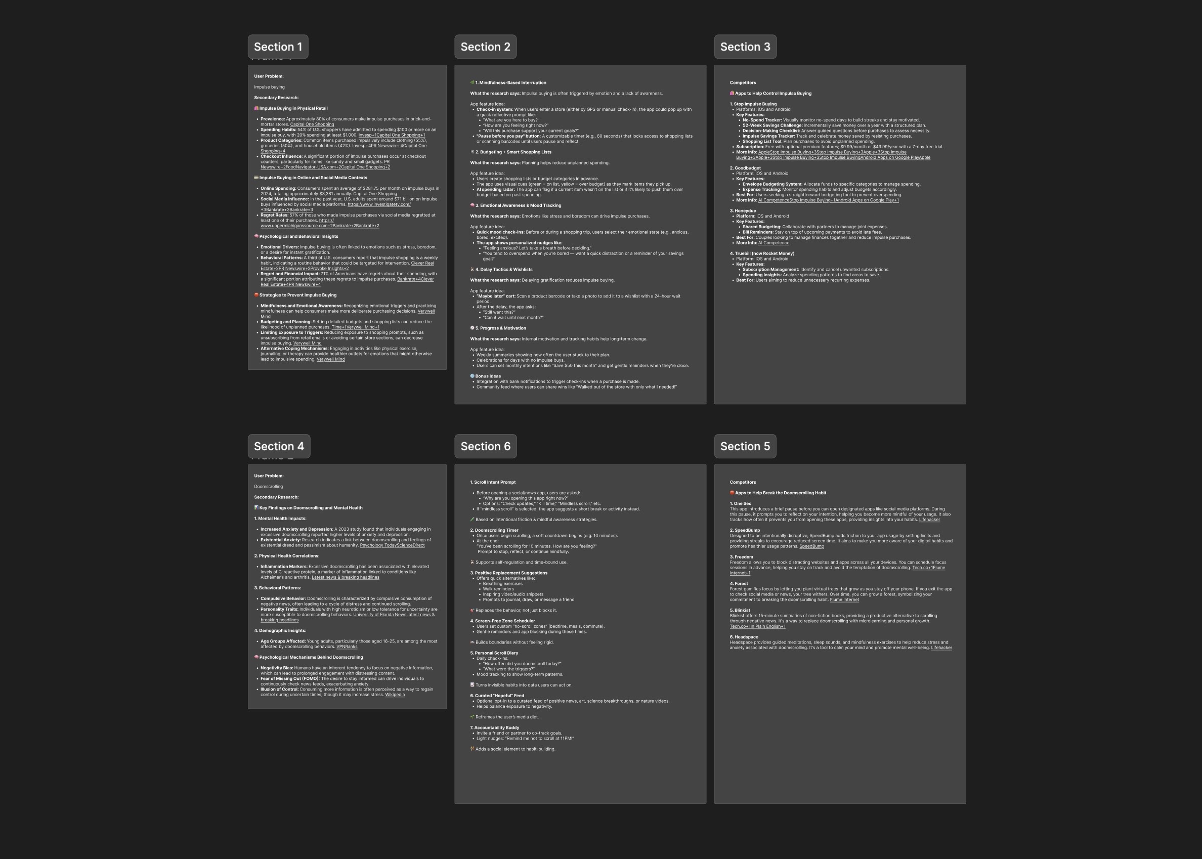
Due to time constraints, I was unable to execute primary research. I used ChatGPT to assist me in looking for research studies on impulse buying. Some key findings include:
💳 54% of U.S. shoppers have admitted to spending $100 or more on an impulse buy, with 20% spending at least $1,000.
🤕 71% of Americans have regrets about their spending, with a significant portion attributing these regrets to impulse purchases.
💢 Impulse buying is often linked to emotions such as stress, boredom, or a desire for instant gratification.
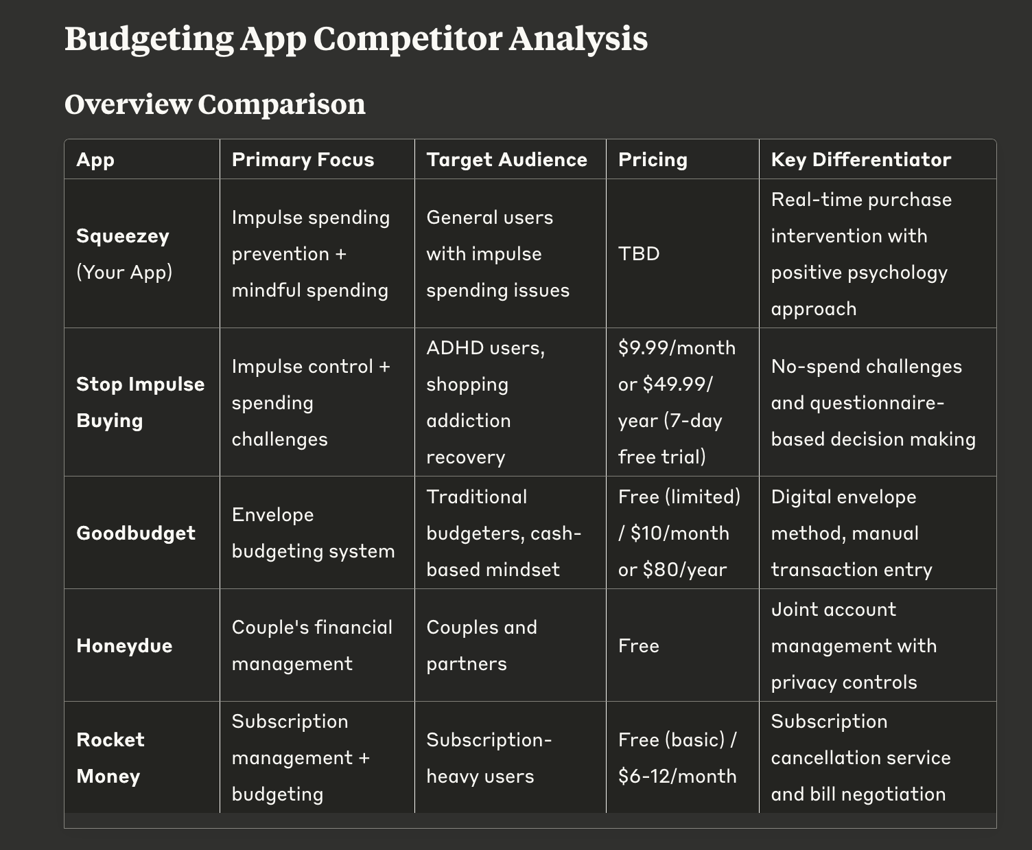
✦ Competitors
To better understand opportunities for Squeezey, I analyzed four existing budgeting and finance apps with the help of Claude. Each offers value, but [.highlighted-textsmall]most are either focused on post-spending analysis or habit tracking, rather than supporting users in the moment of decision-making.[.highlighted-textsmall]
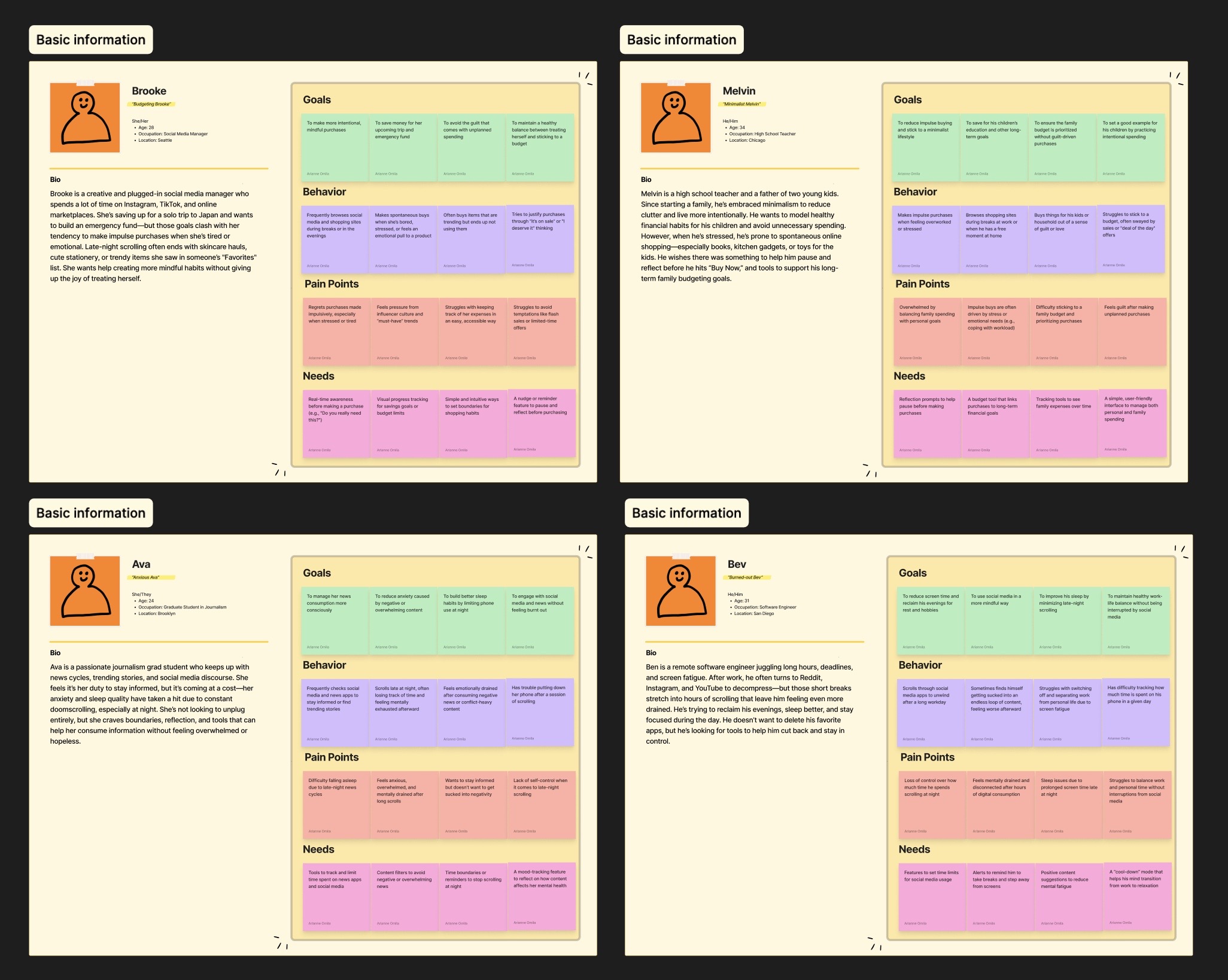
✦ User Personas
To ground the design in real-world needs, I created two user personas based on common behaviors around money management.
Key Findings
✋ Minimal hand movement is essential
👁️ Visual displays must not obstruct environmental awareness
⚠️ Information hierarchy must prioritize mission-critical data
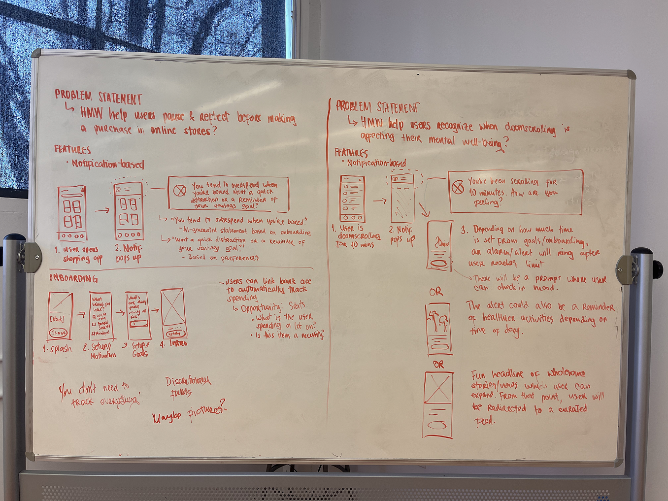
How might we help users pause, reflect, and make smarter buying decisions with their existing spending power to prevent impulse buying?
I established three core principles based on our research findings:
✦ Minimalist
Display only essential information by default at all times, like their vitals. Additional elements will appear contextually and/or by choice via customization settings.
✦ Non-obtrusive
UI elements must harmonize with the lunar environment to prevent visual fatigue and confusion. Our team’s idea is that the system must be doing the most work, not the users.
✦ Instinctive
Interaction flows require immediate, clear feedback for all user inputs.
These principles guided design decisions throughout the project, allowing us to maintain user focus despite technical constraints and timeline pressure.
Information Architecture
I created a comprehensive sitemap organizing features around NASA standard procedures and astronaut workflow needs. I also added customization options so users could adapt the interface to individual mission requirements and so that they’d feel more comfortable with the LCD24.
Wireframing
After a team review, the wireframe was materialized. It displayed the process flow and visual modules. With this guide in hand, it allowed for an easy basis for coding.
I also outlined which elements call for feedback cues and positioned the action buttons.
Interaction Design
I developed UI components in Illustrator that maintained visibility across varying lunar lighting conditions while reducing cognitive load through consistent visual hierarchy.
Prototyping
I collaborated with developers to implement the design in Unity for the HoloLens 2, ensuring the interface functioned as intended in an AR environment.
The previous spacesuit system was entirely limited to the pressurization of the suit. With LCD24 as a display system in the visor, it will help minimize user movement—a user need with utmost priority. Our input system largely includes eye tracking and voice commands, with only a minimal amount of hand movement.
[.highlighted-text]For a minimalist design,[.highlighted-text] we keep only the most necessary elements visible to the user at all times, like their vitals. Only when triggered will other elements be displayed unless otherwise customized.
[.highlighted-text]For a non-obtrusive design,[.highlighted-text]the UI must be harmonious with the lunar environment. This is also made possible with a minimalist UI workspace. Since the LCD24 is already complicated enough, it must visually and systematically be seamless so as to prevent fatigue in usage. Our team's idea is that the system must be doing the most work. The important thing is for the users to feel that they have a task management system that isn't as hefty as their spacesuits!
[.highlighted-text]For an instinctive design,[.highlighted-text] we must ensure a smooth process flow and an effective feedback system that will always respond to user inputs.
I wanted to look into it in greater detail, having been guilty of impulse buying myself, and identify leverage points that my solution can utilize.
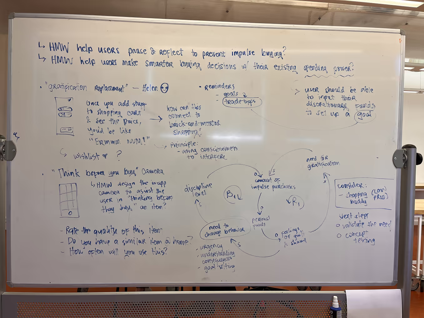
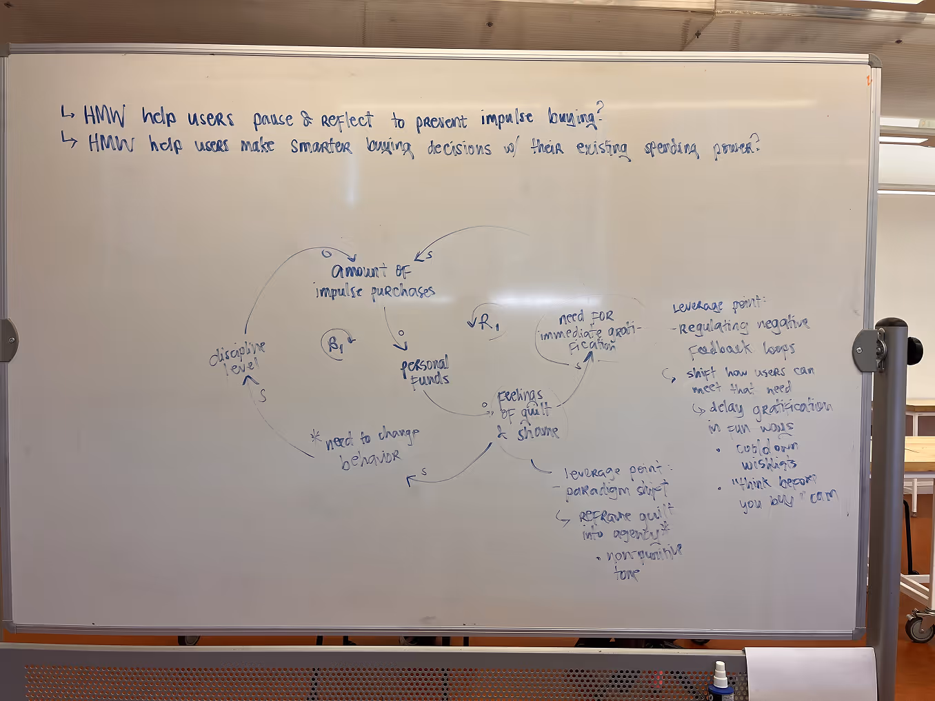
The diagram demonstrates what elements create reinforcing and balancing feedback loops. In the reinforcing loop, [.highlighted-textsmall]the need for immediate gratification as well as feelings of guilt and shame can be points of intervention because these two are connected in a way that amplify the need to impulse buy.[.highlighted-textsmall] I reverse engineered it by introducing key variables that dampen this amplification.
Here are the two core solutions that came from the leverage points:
⏳ Delay gratification in fun ways
💪 Reframe guilt into agency
We were challenged as students to create something completely beyond our scope. Even with mentors and consultants, the team had difficulty finishing the LCD24 on time for the following reasons:
✶ We were juggling the project with academics and extracurriculars
✶ The team couldn't do an in-person meetup because the project was done during COVID
We didn't make it to the Human-in-the-Loop Testing phase, but we managed to demonstrate a small portion of the software to high school students and the NASA panelists. Although we didn't win the NASA challenge, we had a meaningful experience delving into the professional world of coding, UX/UI design, and space.
I myself, as the sole designer in this project, had a lot of takeaways. These are the biggest lessons I learned:
✶ [.highlighted-text]A large-scale project requires a longer timeframe, a conducive environment, and a knowledgeable team.[.highlighted-text] Given that the challenge is, well, a challenge, we have no control over the logistics in external affairs. The experience, however, still begs that software design projects be approached with no rush unless absolutely necessary. We had to learn Unity from scratch and I practiced a bit of C# coding as well in under a month. My background in design significantly eased the group's stress, but the workload remained heavy and overwhelming.
✶ [.highlighted-text]Self-learning is doable, but difficult.[.highlighted-text] Our project, especially with its topic and scope, was extremely difficult to do on our own. It required a certain level of commitment to seek out resources online. Because I was the only designer, and I only knew graphic design, I had to shift the way I looked at everyday things to understand how to go about the UX process.
✶ [.highlighted-text]Keep in contact with mentors and consultants.[.highlighted-text] Interviewing a NASA astronaut was difficult to achieve, but we pursued it anyway and gained insights that cannot be found someplace else. Under their tutelage, we can adjust our goals to become clearer, more informed, and much more realistic.
✶ [.highlighted-text]Project management is the key to success.[.highlighted-text] I was also the project manager for both social media and operations. While skills and knowledge are what catalyzes the project execution to its success, project management is the very foundation of it. Without organized files, schedules, feedback, and analytics, the team would find itself rather stuck because they couldn't see a way to move forward (and even backward).
✦ Leverage Point 1: Delay gratification in fun ways
Impulse spending is driven by immediacy. To interrupt that loop, Squeezey adds friction.
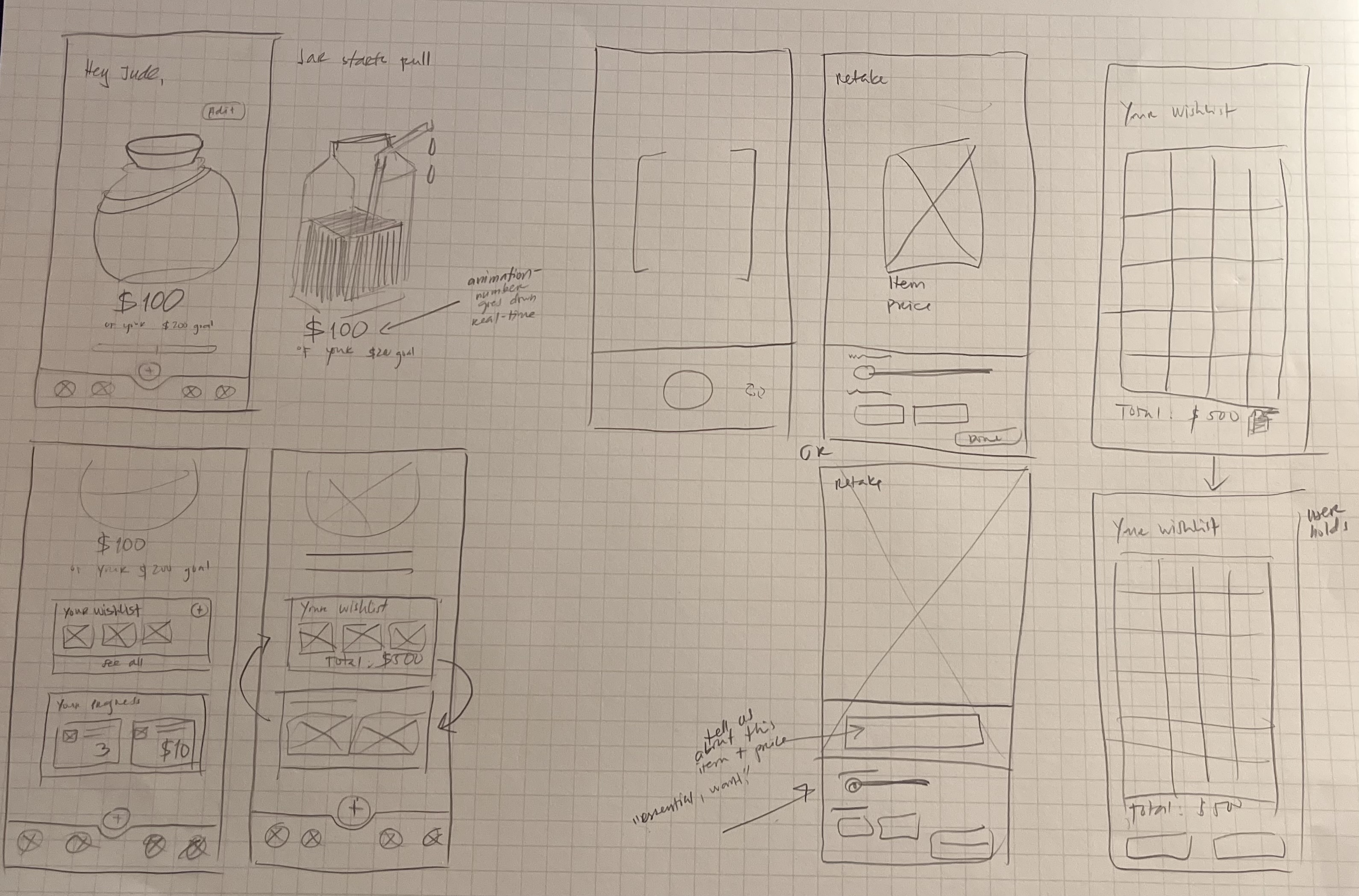
[.highlighted-text]⏱️ Cooldown Wishlist[.highlighted-text]
Instead of buying right away, users can add an item to a wishlist.
[.highlighted-text]📸 “Think Before You Buy” Camera[.highlighted-text]
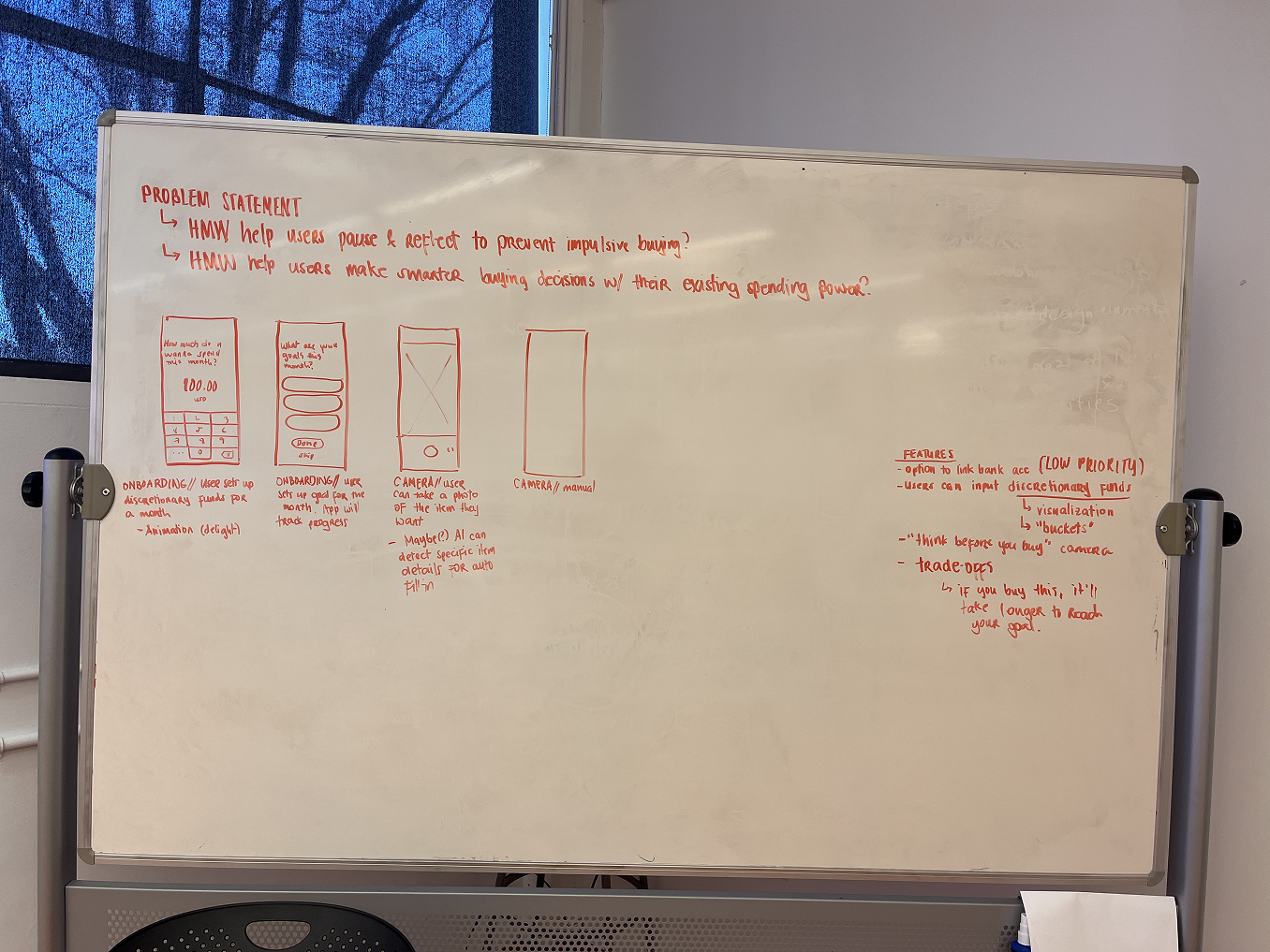
Users snap a photo of the item they want. This creates a visual memory they can revisit later, paired with reflection prompts like “How important is this item to you?” or “Do you have a similar item at home?”
✦ Leverage Point 2: Delay gratification in fun ways
Instead of scolding users after a purchase, Squeezey builds self-awareness and rewards small wins.
[.highlighted-textsmall]💸 Visual "fun" budget meter[.highlighted-textsmall]
Discretionary money is represented as a juice carton. It’s a playful, intuitive way to track what’s left. The idea is that, by spending your money wisely, you take a sip of your juice. On the other hand, if you spend your money on an impulse purchase, you spill your juice.
[.highlighted-textsmall]🍃 Supportive tone and microcopy[.highlighted-textsmall]
Squeezey uses encouraging language to replace guilt with curiosity and control. Rather than “You overspent,” users might see:“Let’s check in. What felt worth it this week?”
Here’s how a typical Squeezey interaction supports mindfulness at the moment of temptation:
- [.highlighted-text]See Something Tempting?[.highlighted-text] → Open Squeezey and snap a photo of the item
Google Vision API Product Search, toggled by the tap of the AI icon, can automatically detect what product the user wants. To meet the usability heuristic: Error Prevention, the app will ask for confirmation if the API correctly detected the item at hand.
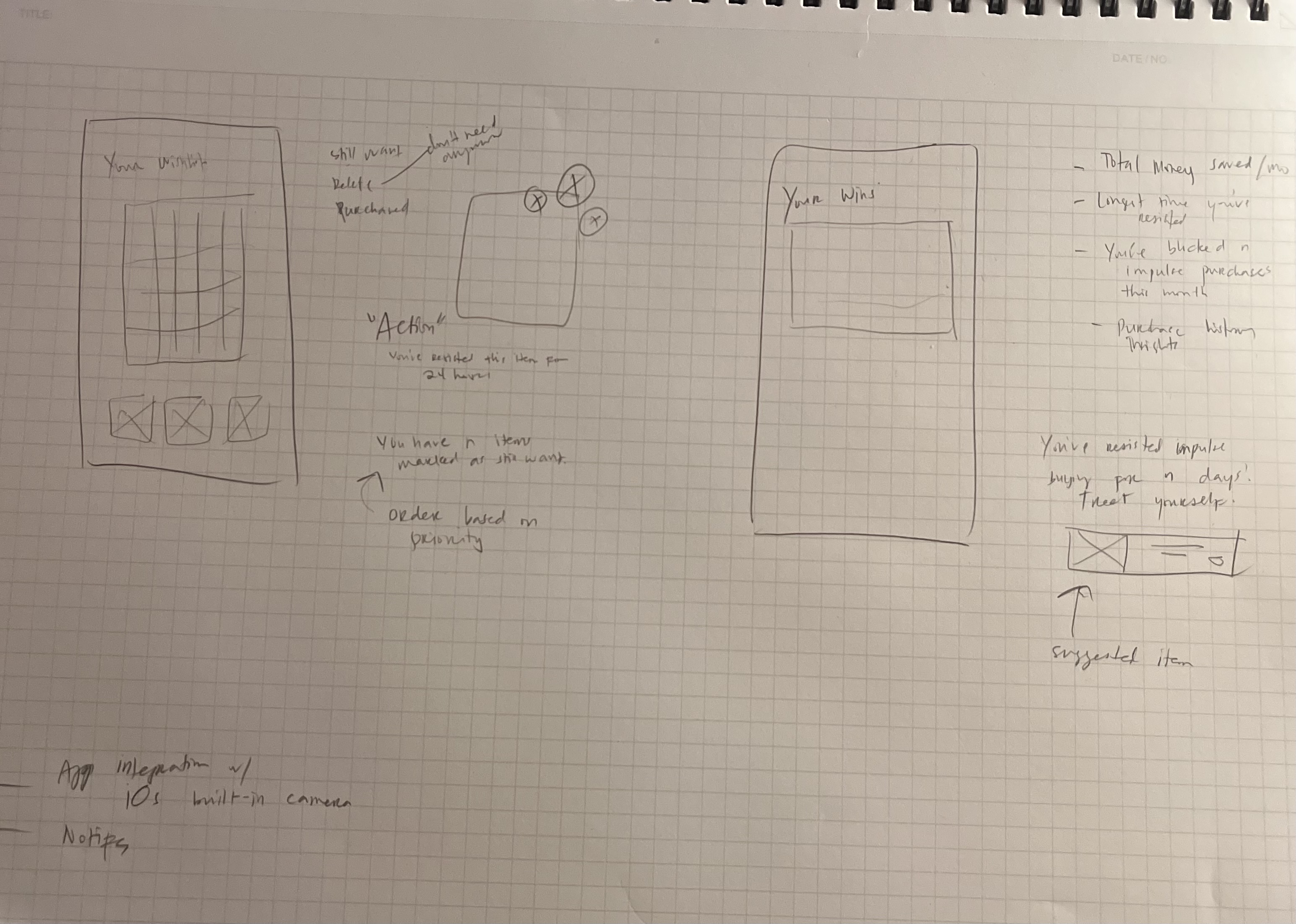
→ Add it to the Wishlist - [.highlighted-text]Reflect During Cooldown[.highlighted-text] → App prompts gentle check-ins like “Still want it?” or “Will it bring joy long term?”
- [.highlighted-text]Make the Call[.highlighted-text] → After the cooldown, the user can either:
✅ Purchase mindfully
📌 Pin the item
❌ Remove from Wishlist (and possibly feel proud of resisting!) - [.highlighted-text]Track Juice in Juice Box[.highlighted-text] → The juice box updates visually in real time
→ Users get positive feedback like “Nice choice— $12 left for fun this week!” - [.highlighted-text]Learn Over Time[.highlighted-text] → Squeezey offers occasional insights:
“You added 6 things to your wishlist this month”
For a first-time user, they are prompted to write down their discretionary funds.
[.highlighted-textsmall]No need to reinvent the wheel.[.highlighted-textsmall]
Everything that characterizes the app has already been used before, such as the wishlist item options (straight out of Pinterest) and the camera UI. I didn’t feel the severe pressure to come up with something on my own, but there was a little nagging voice in my head telling me to be inventive. Existing systems that withstood the test of time have done so for a reason.
[.highlighted-textsmall]Rapid research can be just as valid.[.highlighted-textsmall]
To some extent, of course! As was mentioned earlier, the time constraints forced me to rely on secondary research. I’m lucky to be equipped with tools that are, for the most part, accurate with proper prompting like ChatGPT. For bigger projects, I wouldn’t solely rely on LLMs, but for this specific one, I had to compromise. Rapid research done right is defined by the researcher’s understanding of the app’s foundations— from problem to solution.
[.highlighted-textsmall]Prioritize core features in wireframing.[.highlighted-textsmall]
At crunch time, I had to leave out the Statistics portion of the app. While important, it doesn’t hold as much weight as the dashboard, the camera, and the wishlist. If you’re communicating with your stakeholders, it might be a better idea to introduce all strong points of your system— even if there’s only a few— instead of inserting one weak point. As designers, we understand that wireframes are supposed to be iterative, but another audience might not understand this concept.
While I focused on building a strong foundation for Squeezey, there were several features and metaphors I would’ve loved to explore further, each with the potential to enhance the app holistically, both in terms of usability and emotional resonance.
✦ [.highlighted-textsmall]GPS tracking[.highlighted-textsmall]
Impulse spending often occurs in specific places: cafés, shopping centers, thrift stores, and whatnot. Using location data (with consent) could make interventions more relevant and timely. For example, if a user walks near a store, Squeezy could activate a notification banner.
✦ [.highlighted-textsmall]Notification banners[.highlighted-textsmall]
One of Squeezy’s core goals is to intervene in moments of temptation without feeling restrictive. Subtle notification banners could act as gentle reminders tied to the user’s behavior, such as: proximity to stores they frequent, time-of-day patterns, or spending streaks. These microinteractions could help build habits by inserting just the right amount of friction at the right time.
✦ [.highlighted-textsmall]Statistics[.highlighted-textsmall]
While I didn’t include a stats page in the initial wireframes due to time constraints, it remains an important feature to help users reflect on progress and patterns over time. The key would be to keep the tone light and constructive. It’s less about red numbers, but more about celebrating streaks, progress, and learning moments.
✦ [.highlighted-textsmall]The Juice Box metaphor[.highlighted-textsmall]
The idea behind the “Juice Box” is to create a visual and playful representation of discretionary funds. Instead of a sterile number or bar, users would have a juice box that fills and empties based on their spending.
- Spend impulsively? Your juice leaks out.
- Delay gratification or wishlist something? You save juice.
- Mindful moment? You take a sip of the sparkly juice.
This metaphor makes abstract concepts like budgeting more tangible and emotional, aligning perfectly with the app’s tone and purpose. I believe developing this visual language further could create a more delightful user experience.

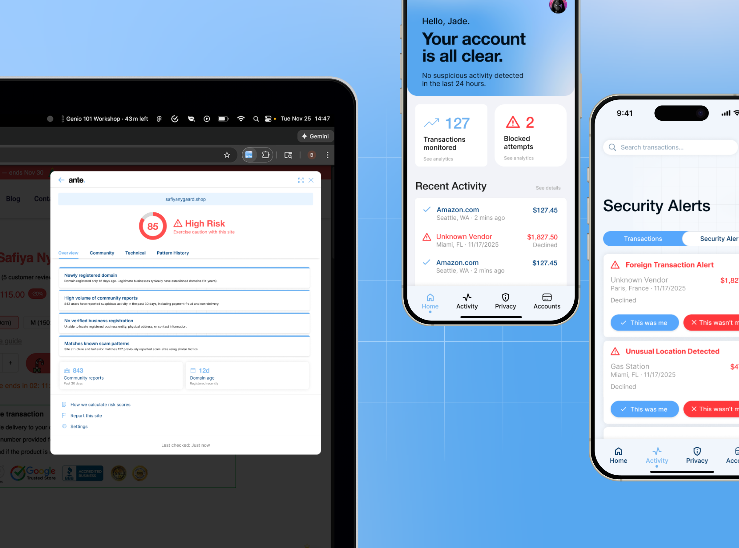
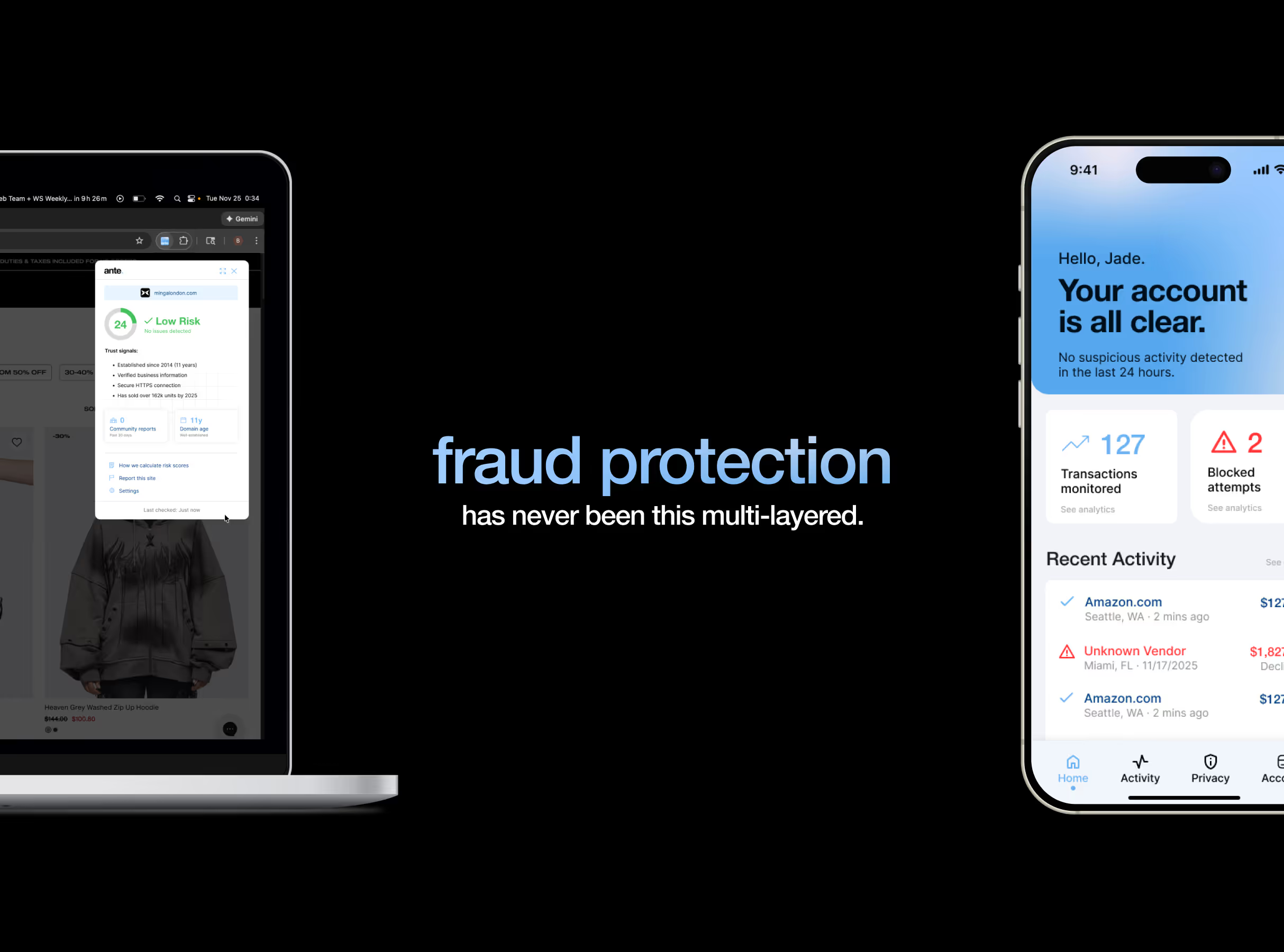
Flare is a multi-modal fraud protection system designed for higher risk mobile users and e-commerce shoppers.
It consists of two complementary products: [.highlighted-textsmall]AnteFlare[.highlighted-textsmall]— a browser extension that prevents fraud before transactions occur; [.highlighted-textsmall]PostFlare[.highlighted-textsmall]— a mobile app that detects and responds to suspicious activity as soon as it is detected.
This approach in a span of four months required us to wear different hats in the design process. I specifically led the design and research for AnteFlare from concept to completion, including the system and research that determined our multi-modal strategy.
For PostFlare, I redesigned the mobile app’s final iteration based on concept testing feedback.
I co-developed the brand identity, coining the names “Flare”, “AnteFlare”, and “PostFlare” to frame our product as a connected system.
With all of this in mind, I redesigned our final pitch deck, produced and animated our video showcase reels, and finally presented our work to 6 design professionals.
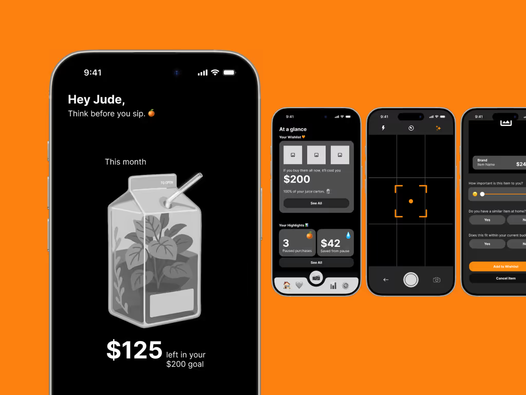
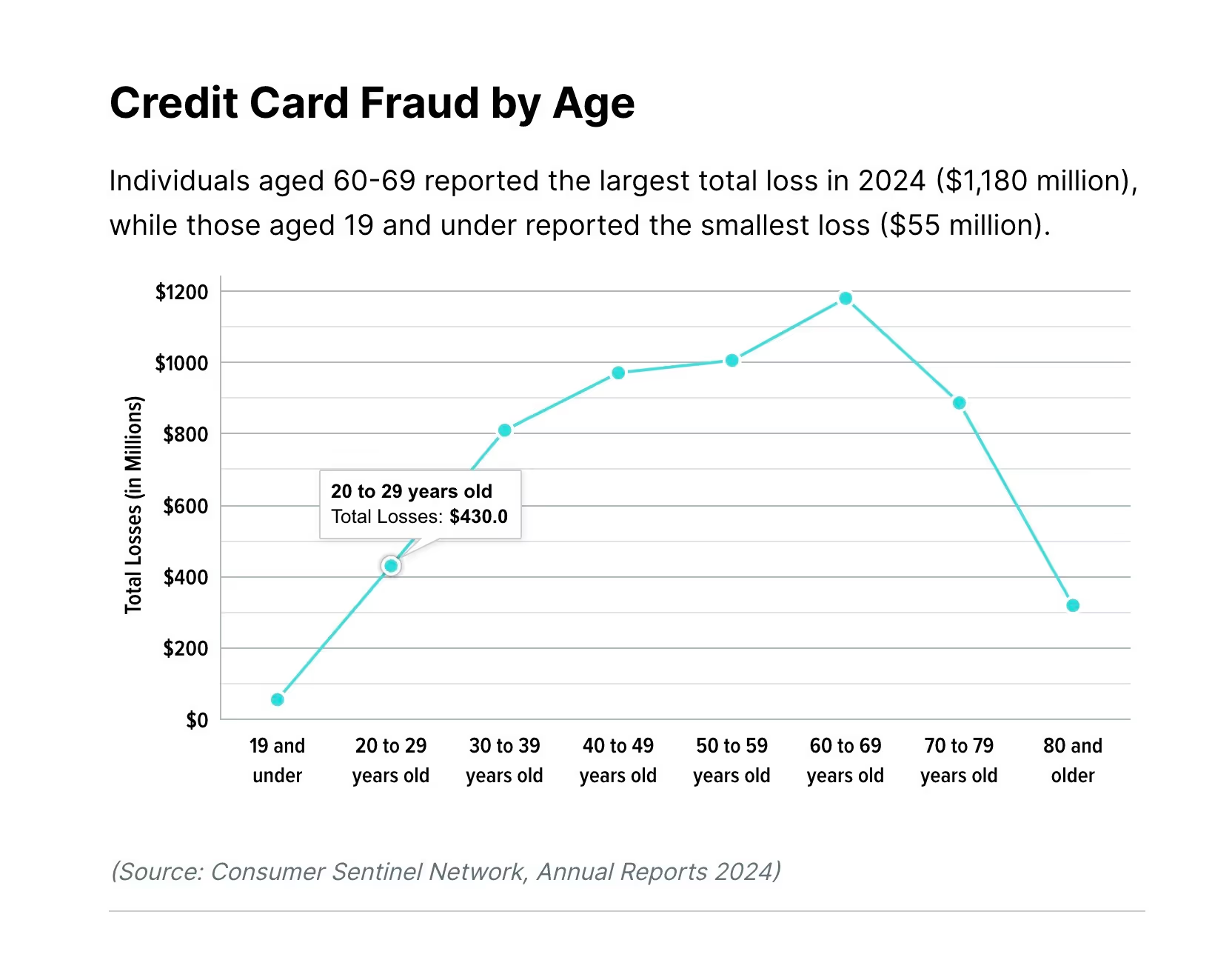
In 2024 alone, there was $12.5B in total losses and 1 in 10 American adults falling victim to scams. Despite 80% of Americans expressing moderate concern about this issue, only 14% subscribe to fraud protection services anyway.
Young adults aged 20–29 are particularly vulnerable:
✦ Around $430M in total losses for this age group
✦ 38% of fraud originates on social media platforms
✦ They use multiple mobile wallets, increasing exposure
To understand why existing fraud protection services have low adoption rates despite a deep need for them, we conducted three parallel research methodologies:
1. Bank Research
We reached out directly to a global banking giant to understand their fraud prevention approach.
Key findings:
✦ Banks offer basic manual tools (lock card, turn on alerts), but they DON’T provide the information necessary to track fraud
✦ Responsibility is placed entirely on customers to monitor and react accordingly
✦ No proactive prevention tools offered
2. Competitor Analysis
We three fraud protection companies and analyzed their offerings.
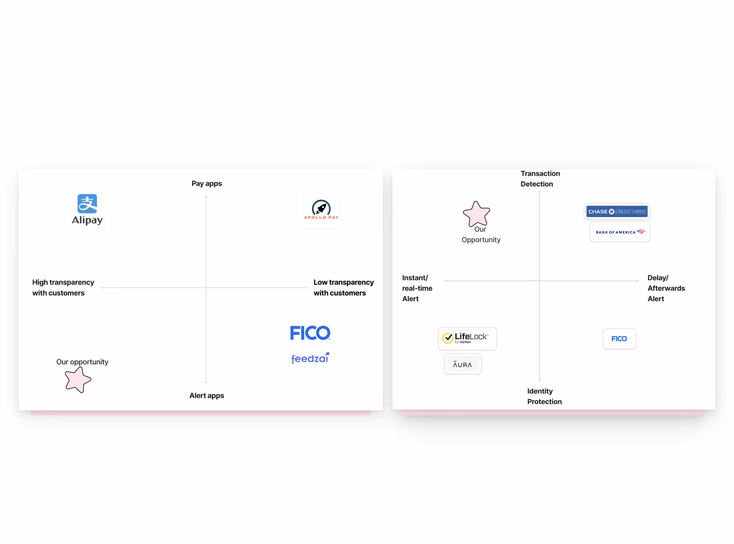
Key findings:
✦ They play in the reactive market, meaning that they are targeting people who are already actively looking for fraud protection solutions
✦ There is a common focus on identity protection rather than transaction-level fraud with mostly email alerts
✦ Require extensive personal data with little to no provision of technical transparency
✦ One key player is an enterprise B2B only with no consumer-facing product
3. Crowdsourcing
We surveyed preventive actions on social media forums to understand current user behavior, receiving around 70 responses
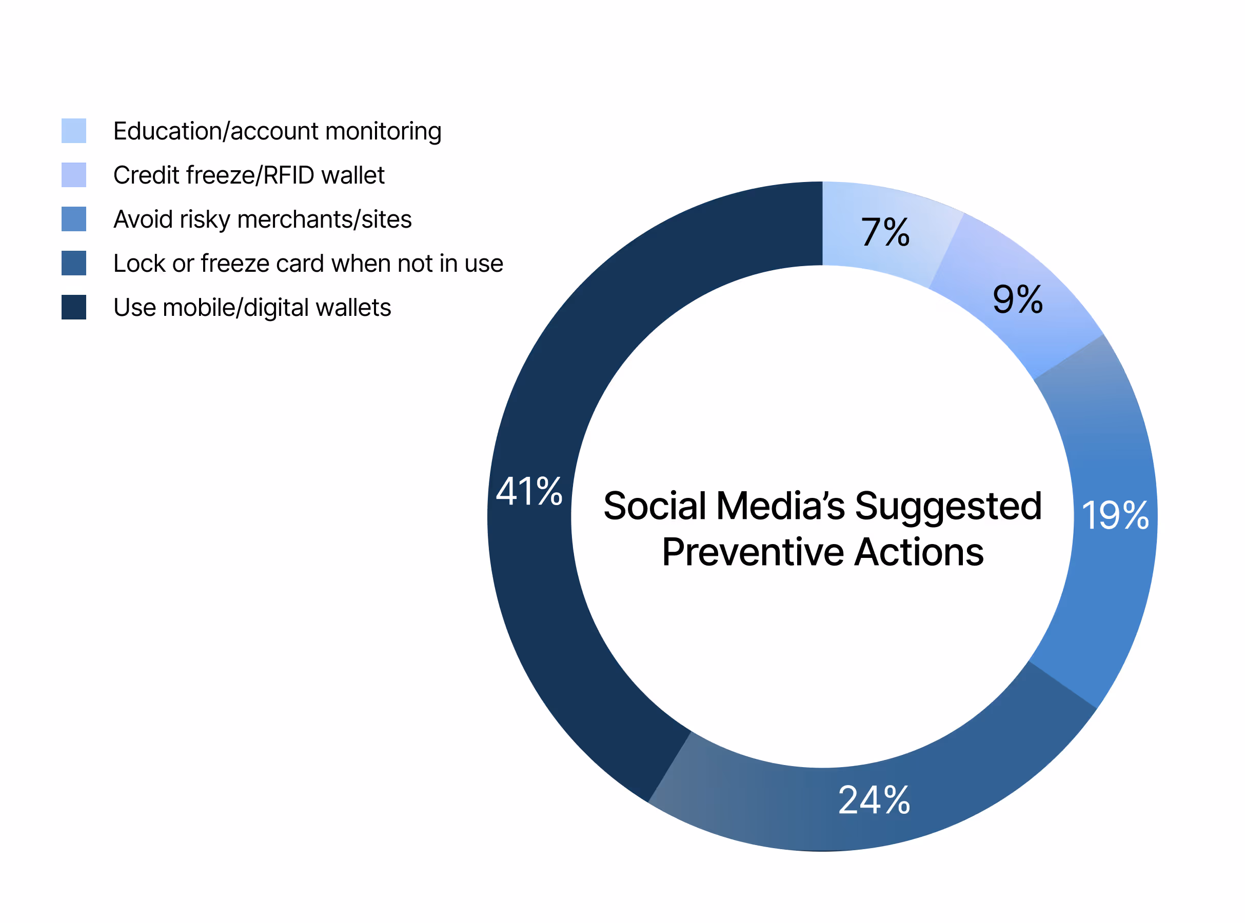
Key findings:
The top strategies were mobile wallet adoption (37%) and manual card locking/freezing (22%).
With these findings in mind, [.highlighted-textsmall]we positioned ourselves to address a massive gap— real-time alert services.[.highlighted-textsmall]
[.highlighted-textsmall]No existing solution combines preventive intervention with instant alerts designed specifically for how young adults transact.[.highlighted-textsmall]
Lack of Urgency
Lack of Clarity
Lack of Security
From this point, we aimed to ask the question:
How might we offer fraud protection to users aged 18–32 that provides transparent risk measurement and urgent alerts before and after transaction, so they can avoid scams and quickly respond to fraud without unnecessary friction?
Flare is designed for different moments of risk, protecting users before and after transaction across two channels.
When we were coming up with solutions, the obvious answer was to leverage our target age group’s heavy mobile usage. After evaluating mobile monitoring options, however, I found that they all had critical limitations: [.highlighted-textsmall]mobile apps cannot monitor what websites users visit in their mobile browsers without using high-friction methods like VPNs or forcing people to use in-app browsers.[.highlighted-textsmall] Browser extensions, on the other hand, can detect website activity in real-time without friction, leading us to split our approach:
AnteFlare for desktop prevention.
PostFlare for mobile monitoring.
(Hover on the image below to magnify the concept map)
Concept Validation
We tested our initial prototypes with 9 participants within the target age group. While both products scored well on usefulness, adoption intent for PostFlare was lower. [.highlighted-textsmall]Users valued data deletion control[.highlighted-textsmall] according to our analysis. This insight shaped our final designs.
AnteFlare: browser extension
Our design principles directly tackle the three critical gaps.
Urgency
Clarity
Security
The extension displays clear risk levels with specific evidence. Legitimate sites show trust signals like established business history, verified information, and secure HTTPS. Suspicious sites, on the other hand, show red flags such as new domains, negative community reports, missing business verification, and patterns matching known scams. Users see transparent reasoning with options to leave the site or proceed anyway.
It's actually pretty intelligent... you can see the thought process behind why it's a scam.
– Rooni, participant
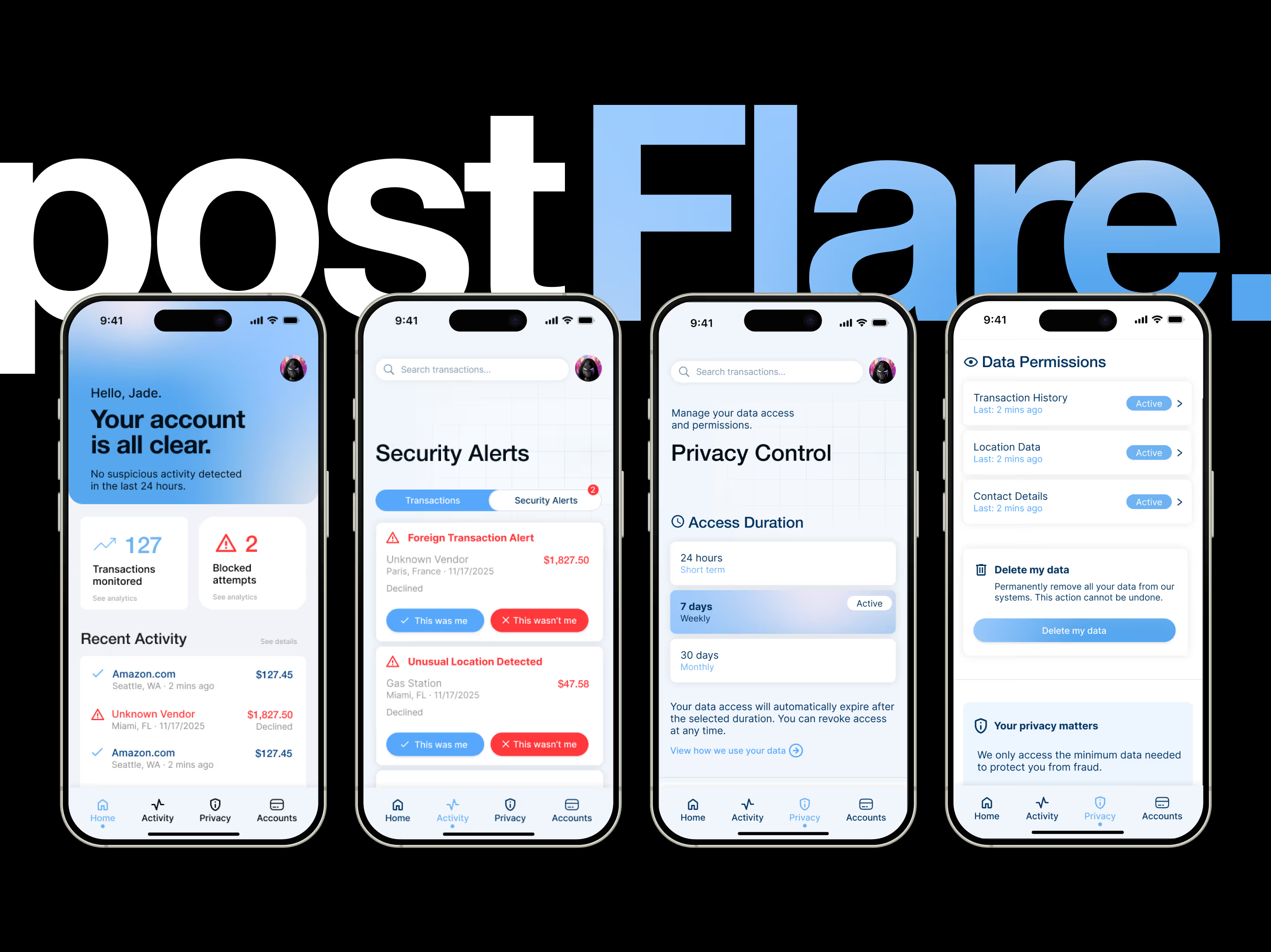
PostFlare: browser extension
Our design principles directly tackle the three critical gaps.
Urgency
Clarity
Security
To address the 3.8/5 adoption barrier, we made the privacy controls explicit and flexible:
✦ Access duration controls: 24 hours / 7 days / 30 days with auto-expiration
✦ Granular permissions: Transaction history, location data, contact details are all revocable with "last accessed" timestamps or "active" status
✦ Data deletion: "Delete my data" button with clear warning
✦ Trust messaging: "We only access the minimum data needed to protect you from fraud"
This shifts the mentality from "giving away my data" to "lending access with control".
I feel reassured when I can delete my data.
– Jeremy, participant
[.highlighted-textsmall]Making a robust and cohesive system with two different products requires strategic positioning.[.highlighted-textsmall] This involves understanding what strengths and constraints each product has in order to inform how they can complement each other. The hardest tradeoff was accepting that PostFlare couldn't prevent fraud the way AnteFlare does, even if it utilizes the best channel (mobile) for our target group. It had to excel in post-transaction detection instead. This clarity came from testing, where users needed distinct value propositions to understand in which context to use each product.
[.highlighted-textsmall]Finding a research gap is like reading between the lines.[.highlighted-textsmall] An opportunity can show itself in an obscure place sometimes, and it's important to have a keen eye. When we were doing our market research, we realized that the opportunity lays in the younger target market, because— despite the obvious and highest fraud losses in people aged 60–69— the trend from ages 20–29 spikes significantly. In other words, the gap was in the steepest curve.
[.highlighted-textsmall]I'd like to actually build the browser extension as my next step.[.highlighted-textsmall] The 4.9/5 usefulness score and the participants' reactions showed a genuine need for a product like AnteFlare. I'm curious to see how I can realize its potential as a real product with concrete impact, especially since it's a lower-stakes project than a mobile app.